Monday, December 7, 2020

Back Cover: From Thumbnail To Final Art

I had a drawing or two that I could have recycled as the back cover image but nothing seemed just right — hit the right note.

The initial concept, sketched while on a lunch break. About 3" tall.
 My rough sketch to establish form and positioning, knowing the image would be a silhouette in it's final form.

This is a rough sketch to find the gesture and positioning of the characters while knowing they would be silhouettes in the final image. Finding strong, easy to read silhouette is a skill I have lots to learn about and is important even when figures are not in silhouette. I need to analyze my work through the lens of "does the outline read clearly?".


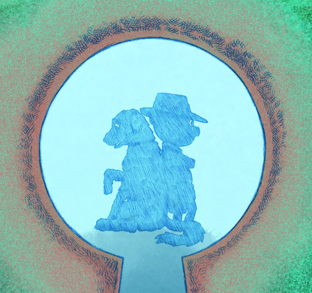
I used a light box to keep the outline I created previously. Again, like with all the other line-art for this book except the front cover, I used a Colerase pencil. The color-shape of the keyhole plate was created in a digital paint program. Late in the creation of this, I thought of Chad and how he does not hesitate to flip an image if it will read better. A flip which has the protagonist looking to the right reads stronger since we in the West react to rightward facing as the direction we're heading in. 

Honestly, this image hasn't gotten the final stamp of approval by either me or the team. It is subject to some color change to better reflect the colors used on the front cover. I'm 95% sure this will more or less be the back cover, just slap a barcode on it.

Monday, October 26, 2020

Mock Book Cover


 In order to communicate a few things to Chad, our graphic designer, I quickly mocked-up this cover using the painting I completed. "The World's Worst Toddler Detective" is not the name of our book, but it was one we were toying with since the early days. 

I like how this one came out even if the font is throw-away and the art deco frame a bit weak. Chad's initial design using my artwork was very snappy, refined and showed off his excellent art deco frame, but in my opinion was a bit too modern and sleek for this project. He didn't disagree. 

And now we await new iteration incorporating this feedback. I'm excited!

Wednesday, August 26, 2020

COVER PROCESS/PROGRESS

 Hi, Readers! Here is a long overdue update! 

I've been working on cover art. The following process images are my latest efforts to figure out how I will use color to paint the cover. This is a digital experiment but I do intend to make a gouache painting for the final art. At this point, working with color in my digital paint program is better than with any real world media so that is where I have started. 

I am liking where this experiment has taken me but I still feel there is work to be done: figuring out my palette, how the lighting will be executed, and light/dark tonality.

Concurrently, I have been practicing gouache technique. That has been quite challenging. There is a lot to learn but I have commited myself to becoming proficient with gouache however long that journey might be and the cover art may have to be executed before I am very happy with my skill level. Also, I've discovered I know a lot less about color mixing than I thought I did!

Coming soon, a post or two showing gouache skills as they progress.

Thanks for stopping to look!

This is a watercolor, ink and gouache mini-painting I did many years ago.


Sunday, July 26, 2020

Readability


Here's a page illustration I reworked. I changed it from the character facing to the left to facing the right which my collaborator, graphic designer Chad Kent, knew would work better. This page is on the left side of the spread and there is another image of the same character on the right side. According to Chad, and of course he's right, she should be facing herself. So, he flipped the whole image, putting the bookshelf on the right side. But flipping the image reversed all the book titles and made them unreadable which I didn't like much. Luckily, the character is on a separate layer than the background so I was able to successfully reverse her with only a little color touch-up.

Beginning Cover Art


I am now thinking about the cover. There is little else for me to do now. I have it in mind to paint the cover image with gouache, a medium which I have very little experience. Gouache was very popular for many years in advertising and illustration and is still used by some in favor of working digitally. It can be used like watercolor and also a little like acrylic but can be reactivated with water.
I am trying to incorporate in this cover illustration art deco elements, which isn't really developed in this thumbnail. Also, I have in mind a cover-less hardback with the design in two or three colors on a periwinkle ground. I may do two illos of the same composition one for the dust cover(more colors and detail) and one for the naked hardback.


Stay tuned for progress on this...